Supplements
Brand launch
Myrkl
We divided the whole process into three stages: developing the strategy, creating graphic materials, introducing, and building the community on social media.
Task
Launch of the Myrkl brand on the Polish market
Building brand awareness among the target group and increasing sales
Our actions
Communication Strategy Development
Brand Positioning
Customizing communication for both groups: pharmacists and consumers
Planning an Advertising Campaign
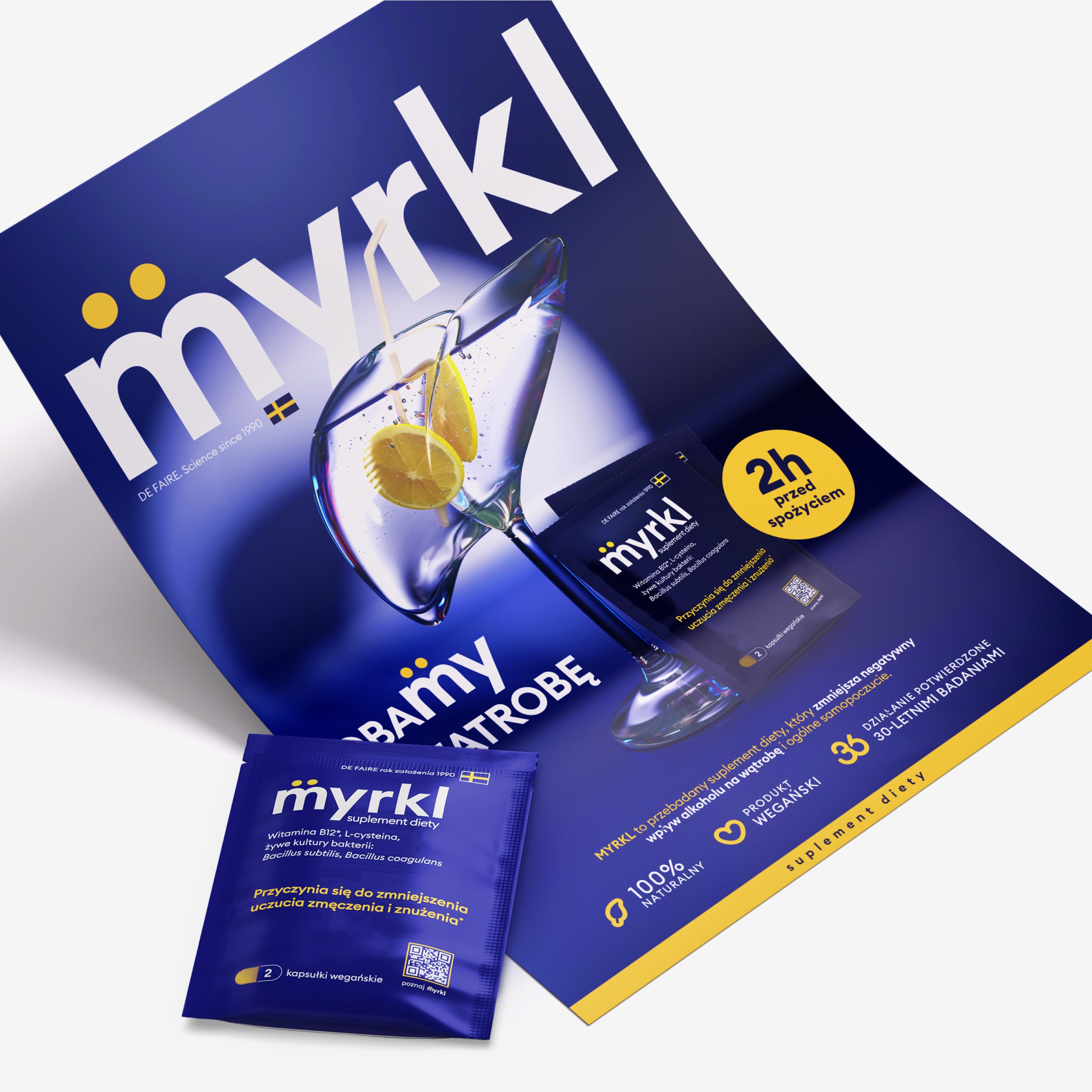
Creation of the main KV
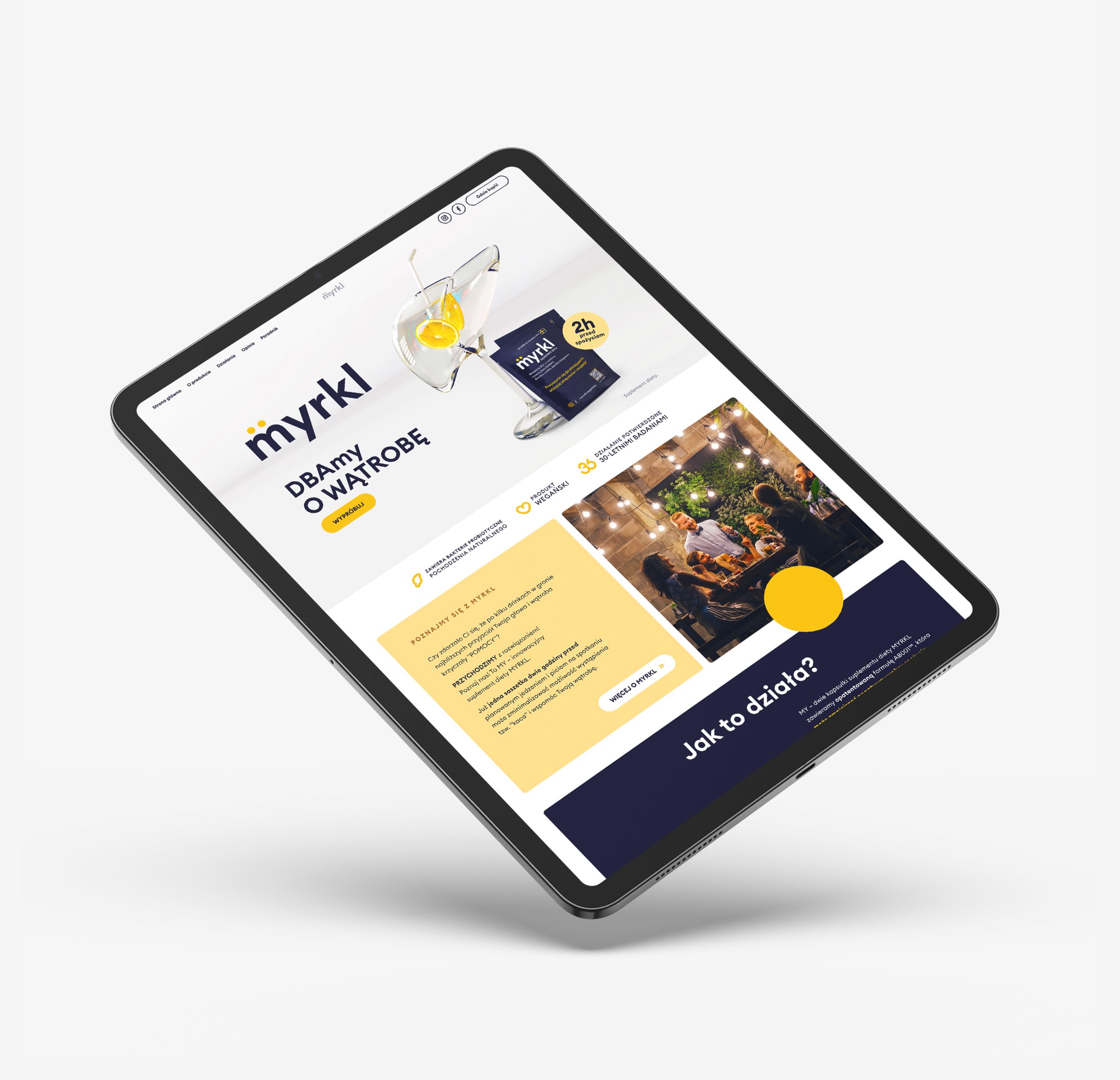
Web Development + Content
Digital actions, channel recommendations for consumers
Banner Campaign
Commercial
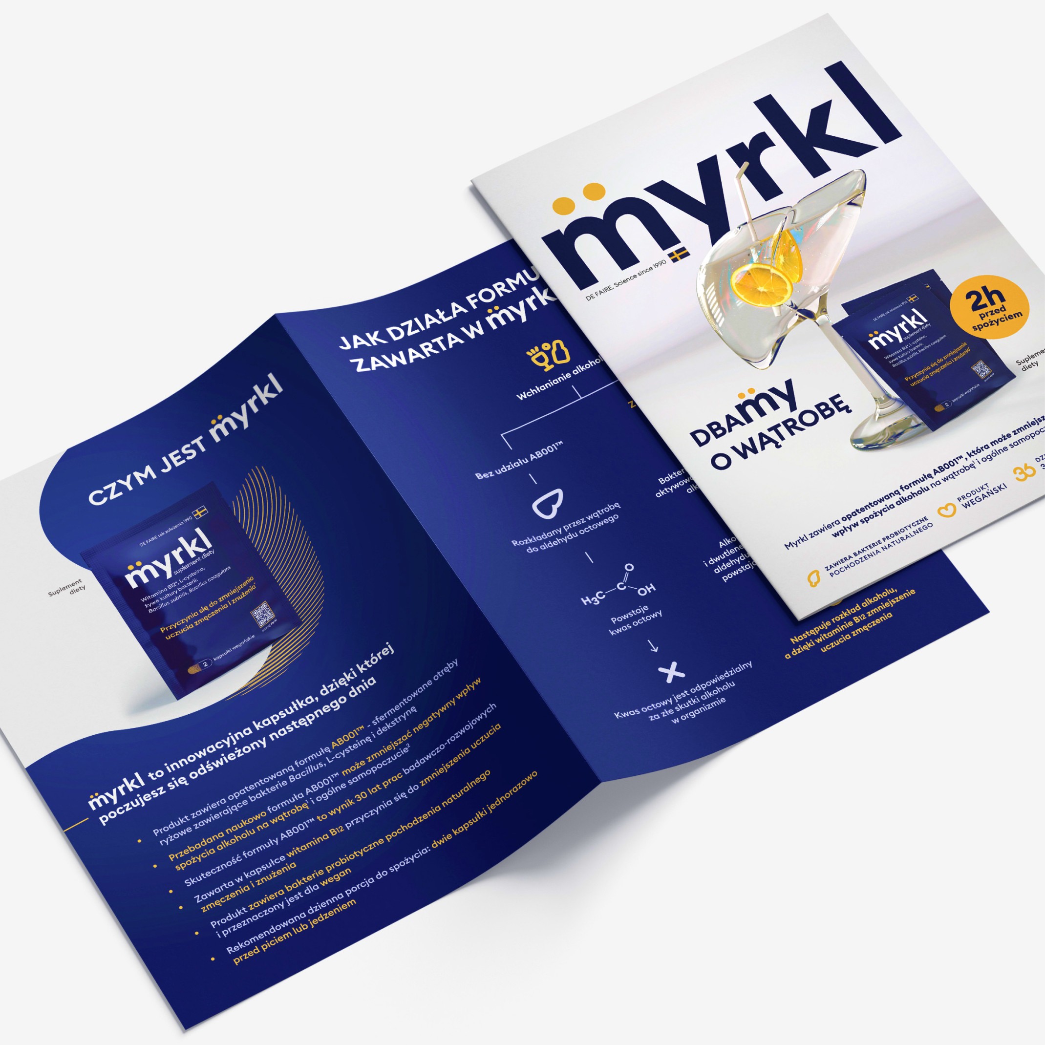
Graphic materials targeted at pharmacists
Brand introduction on social media in collaboration with RSM
Influencer marketing planning executed in partnership with RSM

Strategic approach – because no one does it like we do.
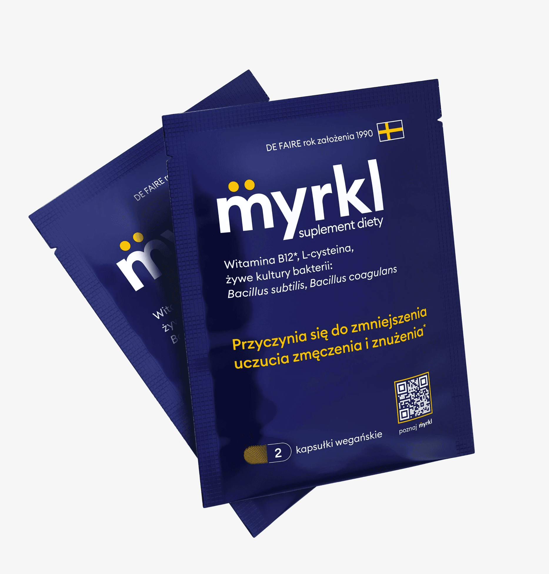
We preceded the grand introduction of Myrkl sachets with a teaser campaign. One of the key elements of the campaign was the advertisement we created, tailored for both the introductory and target campaigns. Together with our partner, Robimy social media, we developed further elements step by step.
In a creative brainstorming session, we planned how to gather the community and create a buzz around the brand. We decided on, among other things: collaboration with influencers and funny spots titled "Mythbusters of Hangovers". We have many more ideas up our sleeve – together we're ramping up MYRKL.
We work with the strategy
Based on the initial assessment of the situation regarding "drinking alcohol in Poland" derived from reports, we analyzed the competition and created the ideal target group by describing personas. We gave the brand the personality of a "rational companion", identified the differentiators, and, along with the developed tone of communication, we created the idea under the slogan "WE". As a result, Myrkl has become a friendly, authentic brand that builds a community around itself.
Author's 3D graphics
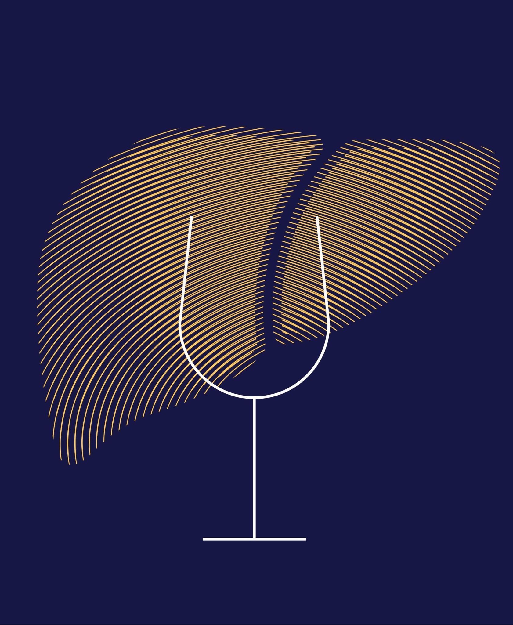
The concept aimed to highlight how the dietary supplement Myrkl works and to place it in the category of products that mitigate the side effects of alcohol. We designed a 3D glass that resembles the shape of a liver. Elements in the form of a straw and two slices of lemon immediately evoke associations with a symbolic drink and the promised "freshness" of the next day.
In this way, we referred to the main function of the product, complementing the graphic with the main claim "we care about the liver". Additionally, we designed the website, aiming for a positive reception of the page.
We approach the strategy comprehensively. A cohesive brand is better remembered by customers. Building awareness in a distinctive way has been our priority.
